| |
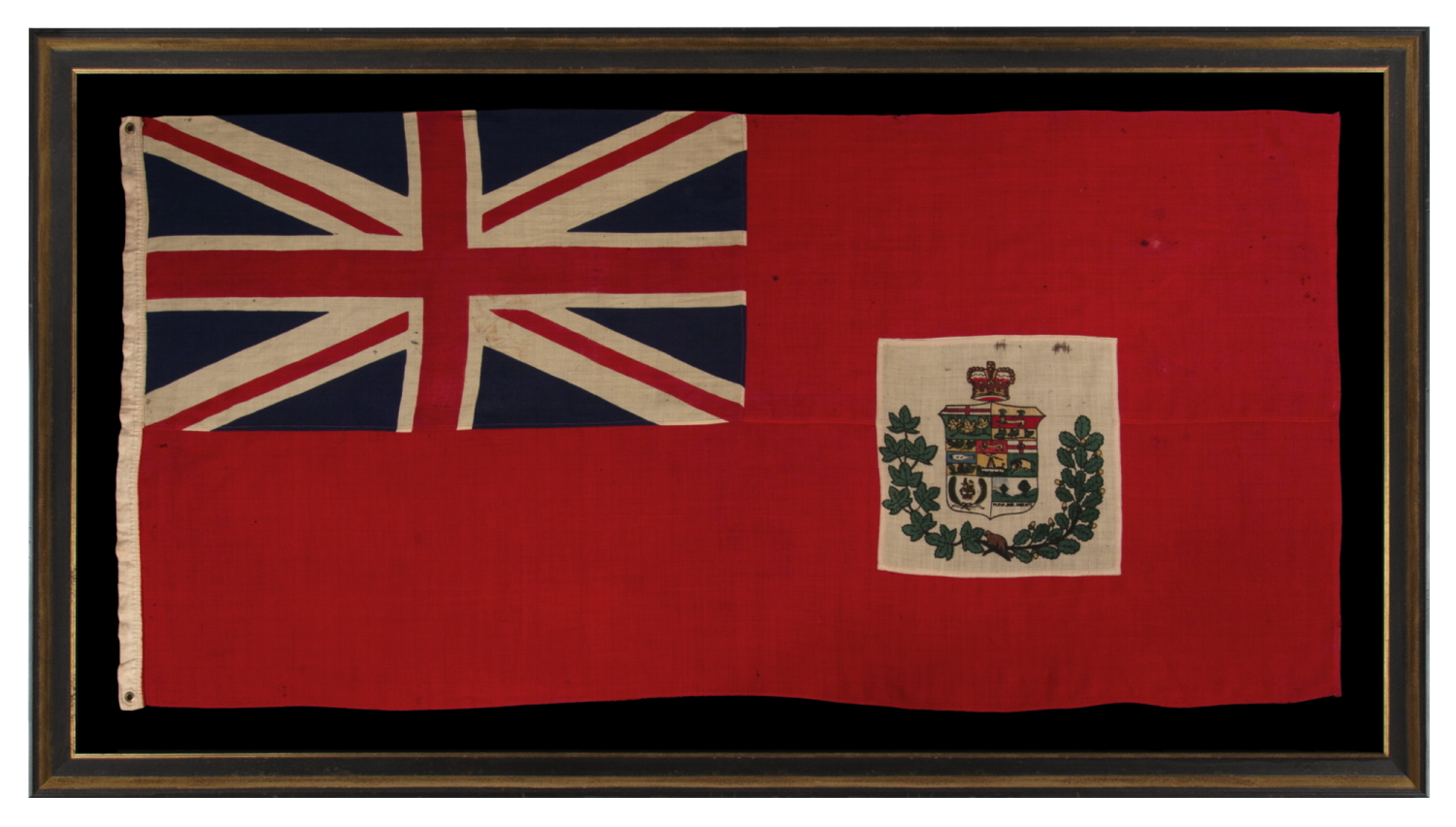
CANADIAN RED ENSIGN WITH A COMPOSITE SHILED THAT FEATURES 7 PROVINCES, IN USE FROM APPROXIMATELY 1873 – 1896; ONE OF THE EARIEST VERSIONS, APPEARING JUST 5 YEARS AFTER THE INTRODUCTION OF THE BASIC DESIGN; HIGHLY UNUSUAL WITH THE DEVICE ON A WHITE RECTANGULAR PANEL |
|
| Available: |
Sold |
| Frame Size (H x L): |
Approx. 57" x 105" |
| Flag Size (H x L): |
45" x 92.75" |
|
| Description....: |
|
Canadian national flag, in one of the earliest versions of the basic design flown following the Canadian Confederation of 1867. In that year the Red Ensign of the United Kingdom (a.k.a., the British Red Ensign) was unofficially adopted and modified, applying a device to represent Canada in the red field. Some of the first examples, displayed in 1868, a beaver was illustrated within an open wreath of maple leaves. Beginning as early as 1870, others replaced the beaver with a crest that displayed the arms of the four British colonies of Quebec, Ontario, New Brunswick, and Nova Scotia. Though not technically adopted as the Canadian national colors, regular display and promotion by Canadian Prime Minister Sir John A. Macdonald (served two terms, 1867-1873 and 1878-1891), both legitimized and quasi-legalized its use.
This general concept was standard in most outposts of the British Empire, where the Red, Blue, or White ensigns of the U.K. were embellished with the arms of the respective colonies, to be flown as national flag, with various adaptations employed for military colors within the respective region.
The Canadian Red Ensign changed over time. As each respective province was added, the emblem of that province would—at least theoretically—be added to the device. The arms of Manitoba, for example, were added in 1870, to reflect its addition, but the Northwest Territories, added in same year, received no signifying emblem until 1957. In extremely rare instance, symbols representing British Columbia were included as early as 1871, but most flags didn’t include this until 1873, when emblems for both B.C. and Prince Edward Island were added.
All of the above had thus occurred within just 5 years of the flag’s emergence. This brought the total to seven provincial badges on the most often seen version, in use from 1873 to roughly 1896. That is the number on the composite shield on the flag that is the subject of this narrative. These appear as follows:
Top Register: Ontario (1867) & Quebec (1867)
Middle Register: Nova Scotia (1867), New Brunswick (1867), & Manitoba (1870)
Bottom Register: British Columbia (1871) & Prince Edward Island (1873)
The open wreath sometimes included just maple leaves, sometimes just oak leaves, and at other times a combination of both, as appears on this particular flag. Sometimes it was either completely comprised of or included roses, shamrocks, or thistle. In or around 1873-74, a beaver was added below the shield, at the point where the branches typically intersect. Sometimes the beaver appeared on top of the crest, but more often, a crown, as seen here.
Beginning in 1873, the entire device generally appeared on a white roundel. While at least one source claims that it always appeared this way on this particular version, in my experience, in the case of printed parade flags (a.k.a., hand-wavers), it can also be seen on an undulating window that traces the perimeter of the combined wreath and shield. The correct response to this conundrum is to simply accept that when something wasn’t official in early flags, never say never; and when it was official, still don’t say it. People did as they would; there were no “flag police,” as a fellow vexillologist friend of mine loves to say, and the dissemination of information was not what it would be today. Whatever the case may be, the white roundel tends to disappear in the 1896 and 1907 versions, then reappear from 1922 onward.
This particular example is the only 1873 version that I have seen that presents the seal on a large, white, rectangular panel, set within the red field. Because it is so visually distinctive and different, the feature results in a flag that clearly stands out in my memory among early Canadian examples that I have encountered.
The British Admiralty approved the Canadian Red Ensign for use at sea in 1892, when this version of the composite shield was accurate. Because British Columbia made a significant change to its coat of arms in 1896, a new device should, theoretically, have appeared in that year. From much experience, however, I can say that the producers of flags and crests such as this very often did not adhere to such guidelines. This may have had a lot to do with the speed and accuracy with which such information was disseminated. When, for example, would a flag-maker or artist in London, New York, of Philadelphia, learn of a change in British Columbia’s seal? And how would the illustration of the new emblems be received? In the case of American state seals, variation tends to be the rule as opposed to the exception. It seems obvious that the necessary information may sometimes have been received by way of written or verbal description only, and that both interpretation of the instructions, and/or artist’s liberty, played major roles in what was actually produced. This is part of what makes early flags so unique and interesting both academically and visually.
A more major change came about in 1907, following the 1905 addition of the provinces of Alberta and Saskatchewan. This increased the number of provincial badges to nine. It was also in this year that the emblems of Manitoba, Prince Edward Island, and British Columbia were modernized.
Because the composite shield that appeared on the flag had become increasingly cluttered, a coat of arms for Canada was officially granted in 1921. This took place by way of Royal Proclamation of King George V. The new device, which featured the coats of arms of England, Scotland, Ireland, and France, with a trio of green maple leaves below, replaced the composite shield on the Canadian Red Ensign in 1922. It was also at this time that Canada’s official colors of red and white were declared.
In 1924, an Order in Council approved the use of the flag for Canadian government buildings abroad. Various changes were proposed afterwards, but a Canadian national flag was not officially adopted until Queen Elizabeth II (of Canada) proclaimed the present maple leaf design. This took place on January 28th, 1965, followed by an official inauguration on February 15th of that year.
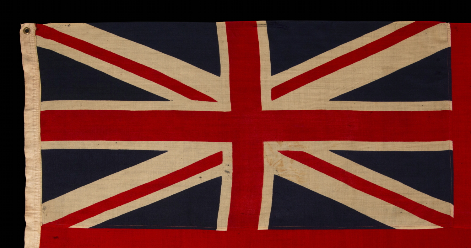
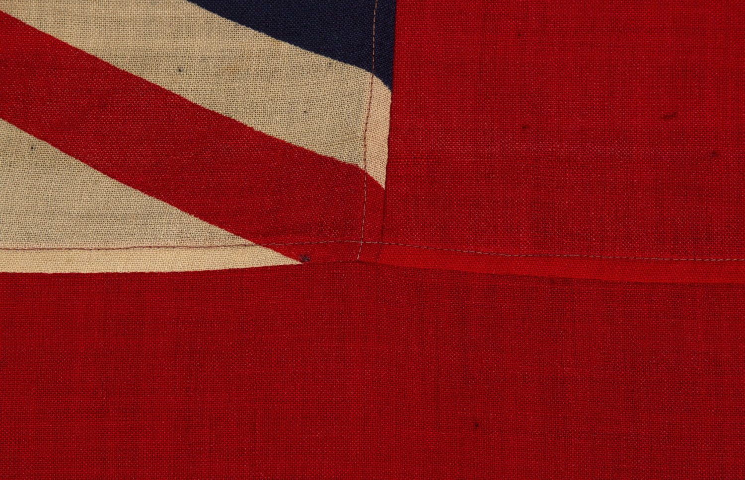
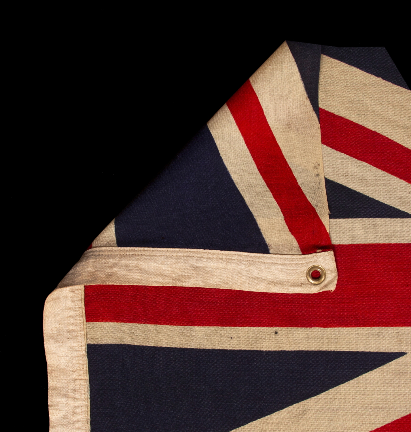
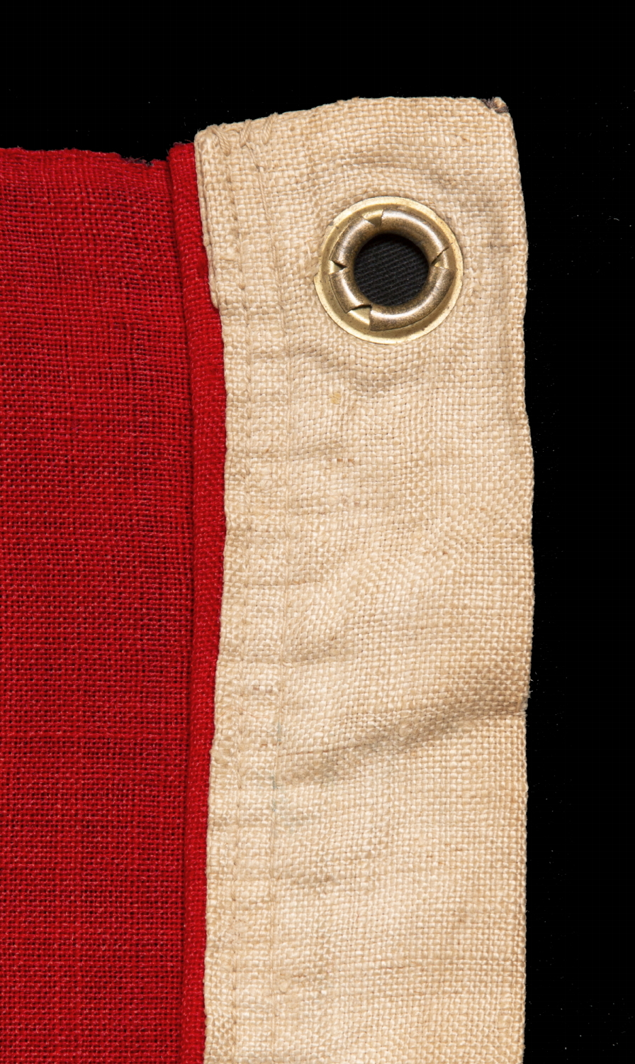
Construction: The British Union flag emblem the serves as the canton is press-dyed on wool bunting. The red field is comprised of two lengths of red wool bunting, that have been joined by way of treadle stitching. The canton was joined to these in the same fashion. The device is printed on both sides of a rectangular panel of white wool bunting, then single- appliquéd onto the red field, below center, towards the fly end. This means that it was stitched to one side of the flag only. A cut-out was made on the reverse, and the red fabric under-hemmed, so that the device could be vied on both sides. Both the application and under-hemming were done by treadle machine and the fly end was hemmed in the same manner. There is a linen or cotton binding along the hoist, possibly with hemp content, applied by machine, with a single brass grommet at the top and bottom. All of the above is expected within the 1873-1896 era.
The manner in which the device is printed is one of numerous indications that this was a very experienced flag-maker. Printing on wool is difficult. Though the flag was found in the States, and may have been produced in America, I suspect that the composite shield, at the very least, was probably British-produced. Printing on wool was difficult. Though the clamp-dying or press-dying process (a form of resist-dying with specially made metal clamps), used to produce the canton was patented in the United States in 1848, and actively pursued by American flag makers in Massachusetts, Philadelphia, and New York, the skill was adopted by British makers, who continued to use the technique well into the 20th century, long after it was largely abandoned stateside. As most wool bunting was imported from the U.K. throughout the 19th century, where wool production in general had been pursued for ages, British techniques regarding the printing and dyeing of it were generally superior on all facets.
Mounting: The flag was mounted and framed within our own conservation department, which is led by expert staff. We take great care in the mounting and preservation of flags and have framed thousands of examples.
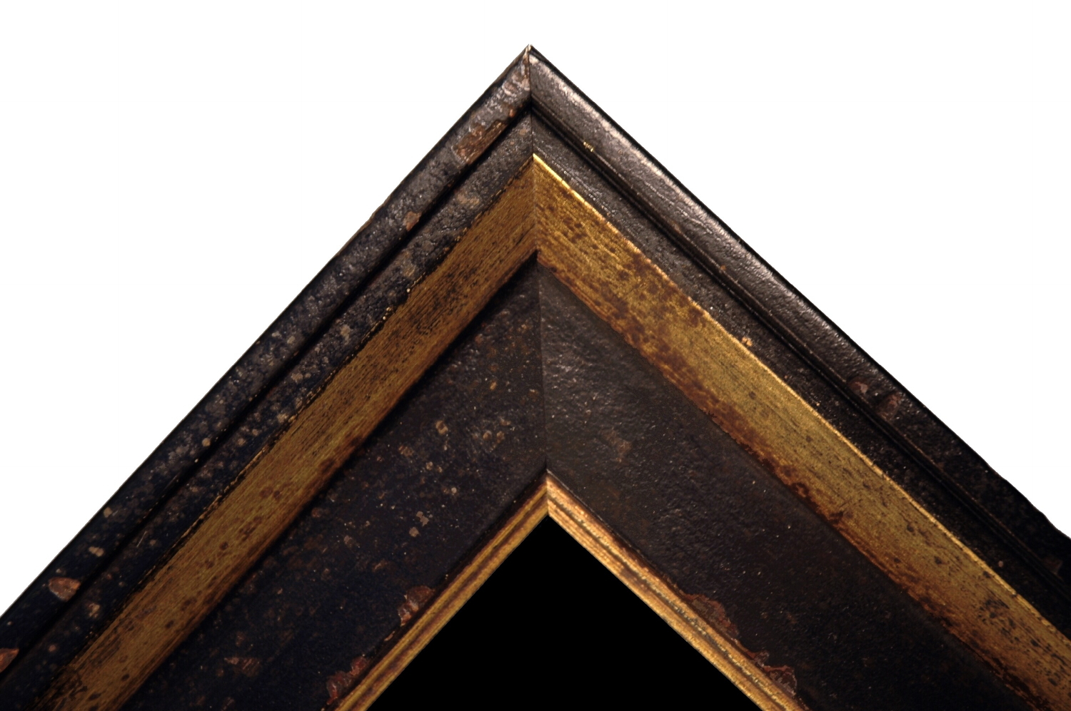
The flag has been hand-stitched to 100% silk organza throughout on the reverse, for support. It was then hand-stitched to a background of 100% cotton twill, black in color, that has been washed and treated for colorfastness. The mount was then placed in a black-painted, hand-gilded and distressed Italian molding. The glazing is U.V. protective acrylic (Plexiglas).
Condition: There are modest striations of fabric loss in the top center of the canton, adjacent to the top edge. There is modest staining in the lower, fly-end quadrant of the canton, and there are some dark stains along the top of the white panel, on which the crest appears. There is extremely minor mothing elsewhere, a minor bleach spot in the red field, toward the fly end, and very minor soiling elsewhere unlimited areas. Many of my clients prefer early flags to show their age and history of use. |
|
|
|
| Collector Level: |
Advanced Collectors and the Person with Everything |
|
| Flag Type: |
|
|
| Star Count: |
|
|
| Earliest Date of Origin: |
1873 |
|
| Latest Date of Origin: |
1896 |
|
| State/Affiliation: |
|
|
| War Association: |
|
|
| Price: |
SOLD |
|
| |
Views: 192 |
|
|
|
)